
Design sprint aimed at improving UI and UX of an innovative recycling depot system with an extra attention on usability and accessibility
Summary
The company
Sartori Ambiente is a company that develops products and technological solutions for the environment, one of which is named “ArcoSTATION”. This product is an automated recycling depot with controlled opening of the hatches, and identification of users.
Me
This project has been done as part of the UX Challenge, a 5-days Design Sprint where solvers have to improve the UX of products and services presented by companies.
The company asked us to redesign the current ArcoSTATION’s digital UX in order to improve appearance, accessibility, simplicity, efficacy and effectiveness.
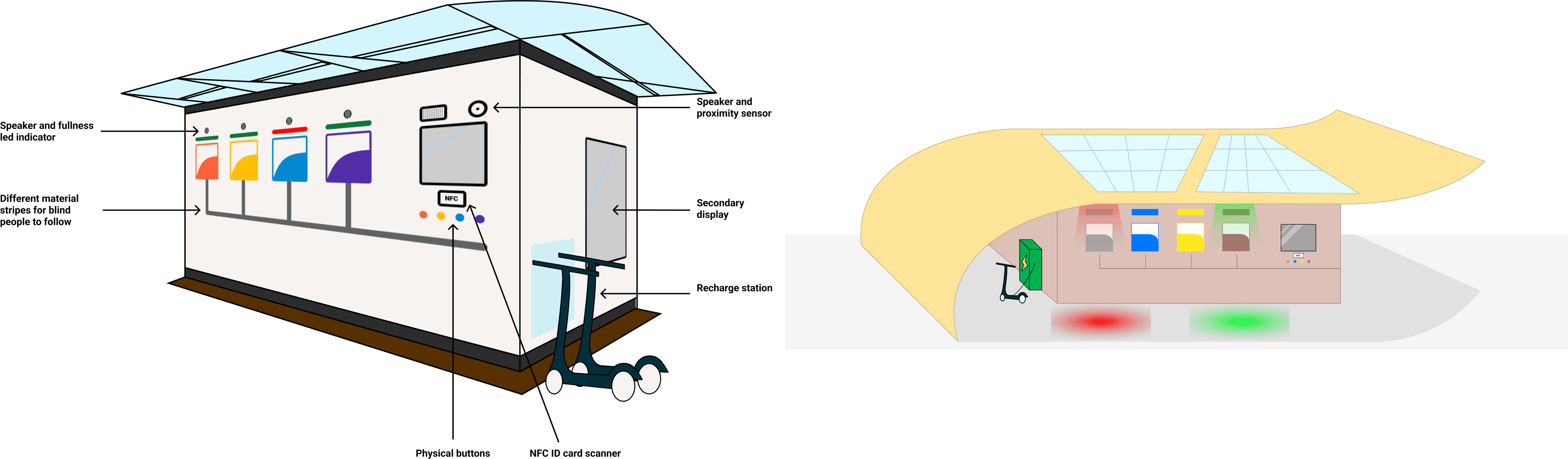
Our aims were not only to satisfy the request from the company but also to propose innovative ideas and concepts. That’s why we also worked on the physical appearance and impact on society of the product.
User interface and accessibility
We redesigned the interface to make it more clean and friendly. Thanks to our initial analysis, testing and interviews we were able to gain a better understanding of company and user's needs. This led to the creation of features that potentially increase both effectiveness and user's experience quality, creating a sense of community and collaboration between both the service provider and the user.
In addition, we added multy-sensory stimuli and a voice assistant to increase the accessibility and hygiene.
Innovation proposal
The proposal was the integration between the product, the society and the environment by the exploitation of different services, building materials and styles. We wanted to elicit the concept of service to society as a broader meaning not limiting the conceptual idea of the product to its main purpose.
The user needs to select the language (IT or EN) in order to log in. Then they can choose the type of garbage they need to dispose. The system then open the dedicated hatch. If the bin is full, then it communicates the user that they can’t throw garbage in that station.
DAY 1: Mapping
DAY 2: Ideation
DAY 3: Decision
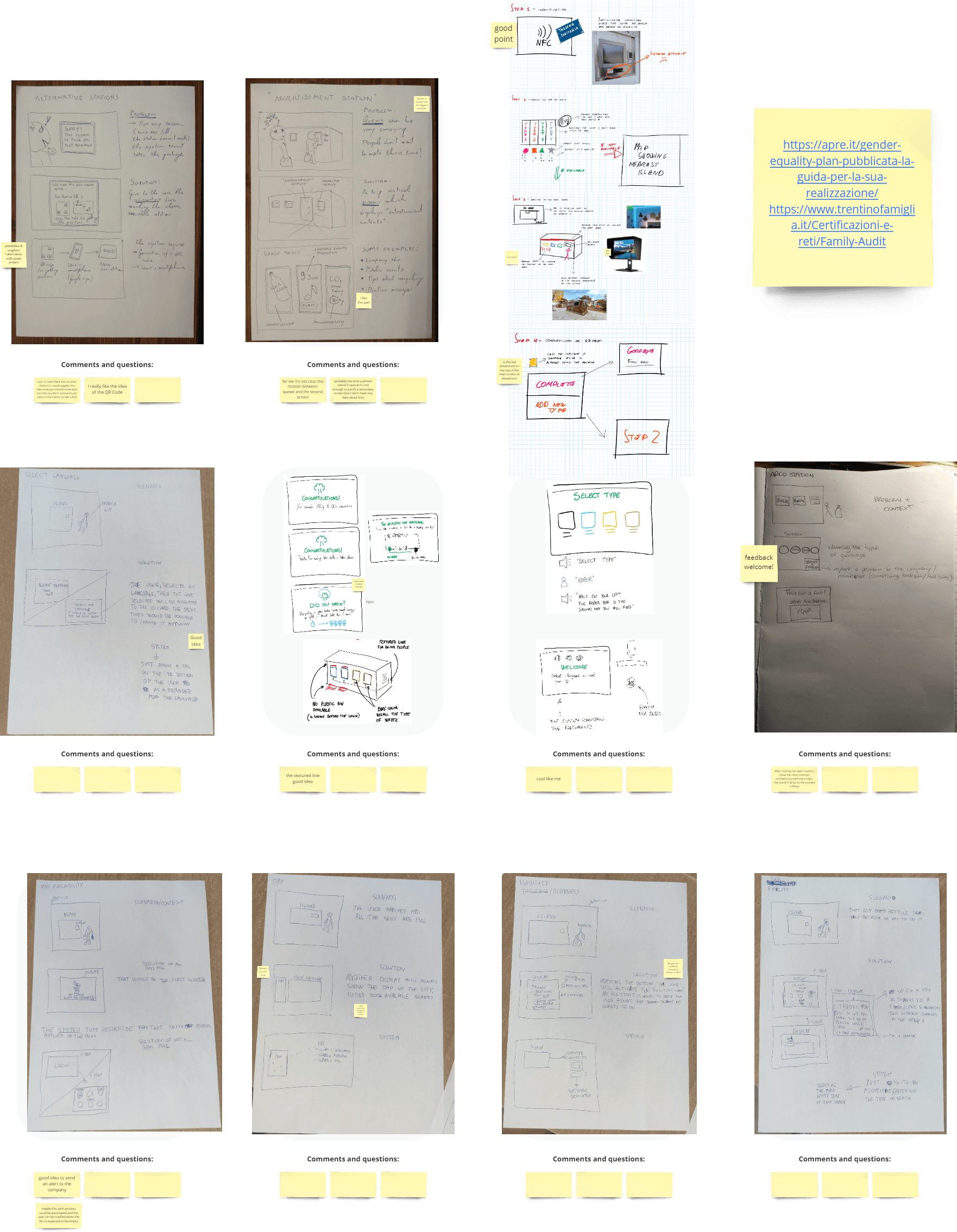
DAY 4: Prototyping
DAY 5: Testing
Like what we did for the digital UI, it's not needed to disrupt a system in order to greatly improve it's usability and experience. Sometimes a small change or an extra feature are more than enough to do the work.
Some other times instead is very interesting to work in a way that allow you to think without "real world boundaries" and see how many concepts is possible to find out. Of course I don't expect every concept to be applicable but to be food for thoughts and element of innovation.
Case Study
First we analyzed the company brief and started outlining our design goals and pain points. To do this we used techniques of Benchmarking, User Journey and Brainstorming.
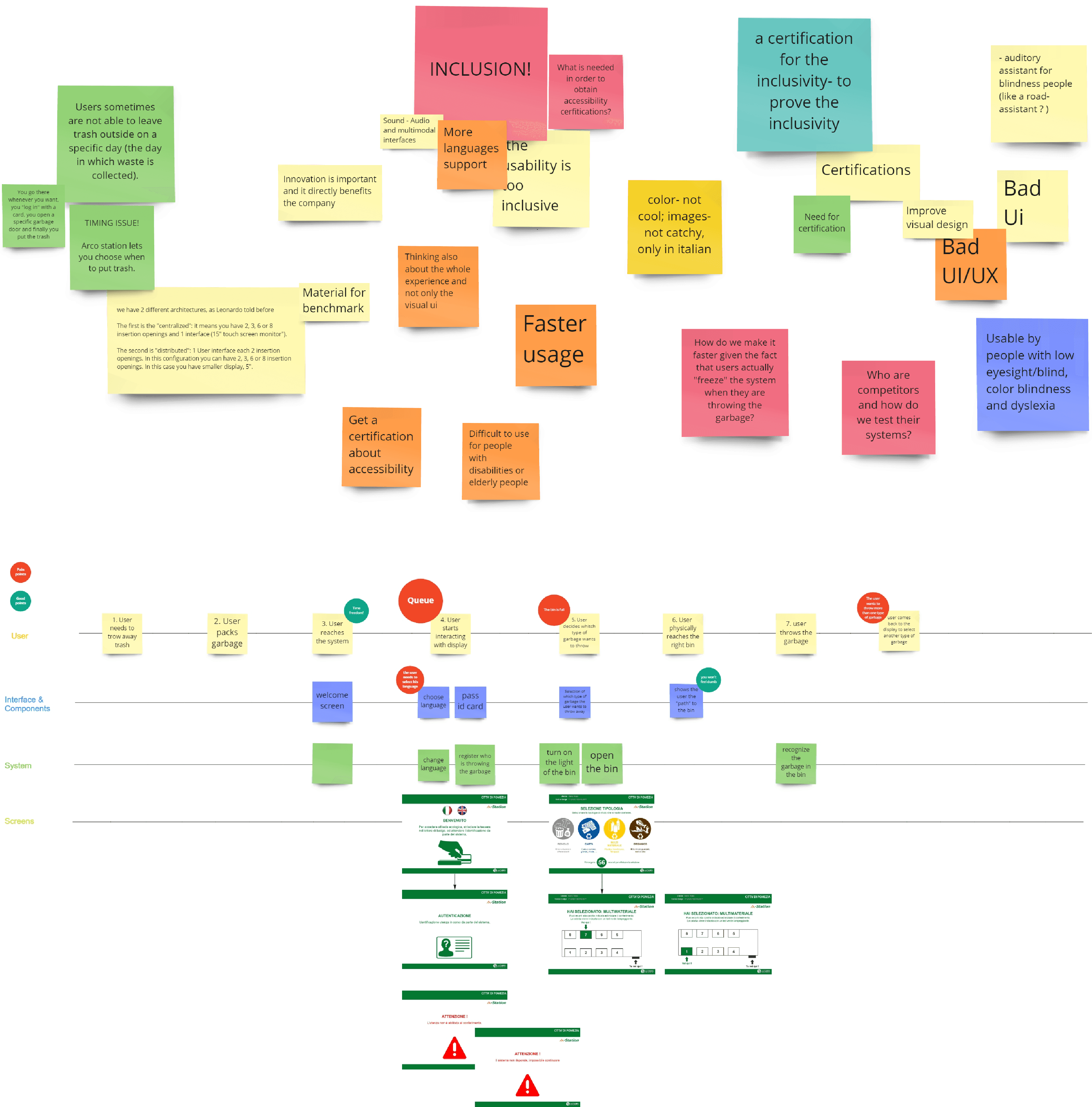
In this step started freely sketching ideas and discussing them one by one all together. In this way we could diverge with several ideas and let our creativity go.
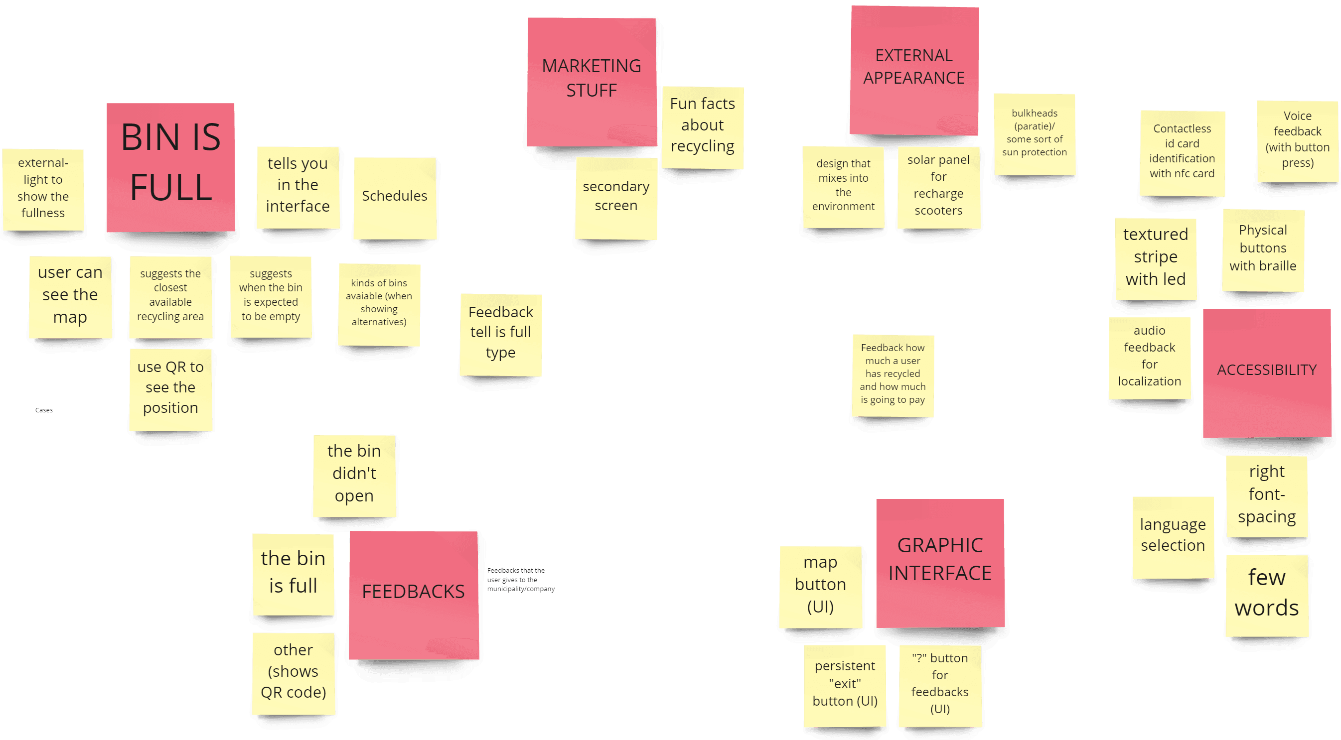
After a divergence a convergence is needed, that’s why we started isolating features previously proposed, filtering and grouping them and validating them with the company.
*due to Covid and University restrictions, we couldn't involve actual users. The personas are the result of our assumptions and of the information about the company we've been given.
We produced two digitally sketched prototypes with the scope to provoke and elicit the company to explore the potentiality of considering their product from a different point of view.
For the digital part we didn't want to be disruptive for the company, even more considering that part of the user flow was already working correctly. That’s why we decided to mainly stick to the already existent flow, improving and expanding it when needed. Moreover, considering that the company was going through a rebranding to appear more modern, we improved the aesthetic of the interface and built assets for the company.
Having a relatively simple interface we exploited all the time we had with users to perform both testing and semi-structured interviews. In this way we were able to grasp several information on users’ needs and opinions that mostly validated our insights and design choices. But most important we were able to identify flaws in our design that future interactions of design could fix.
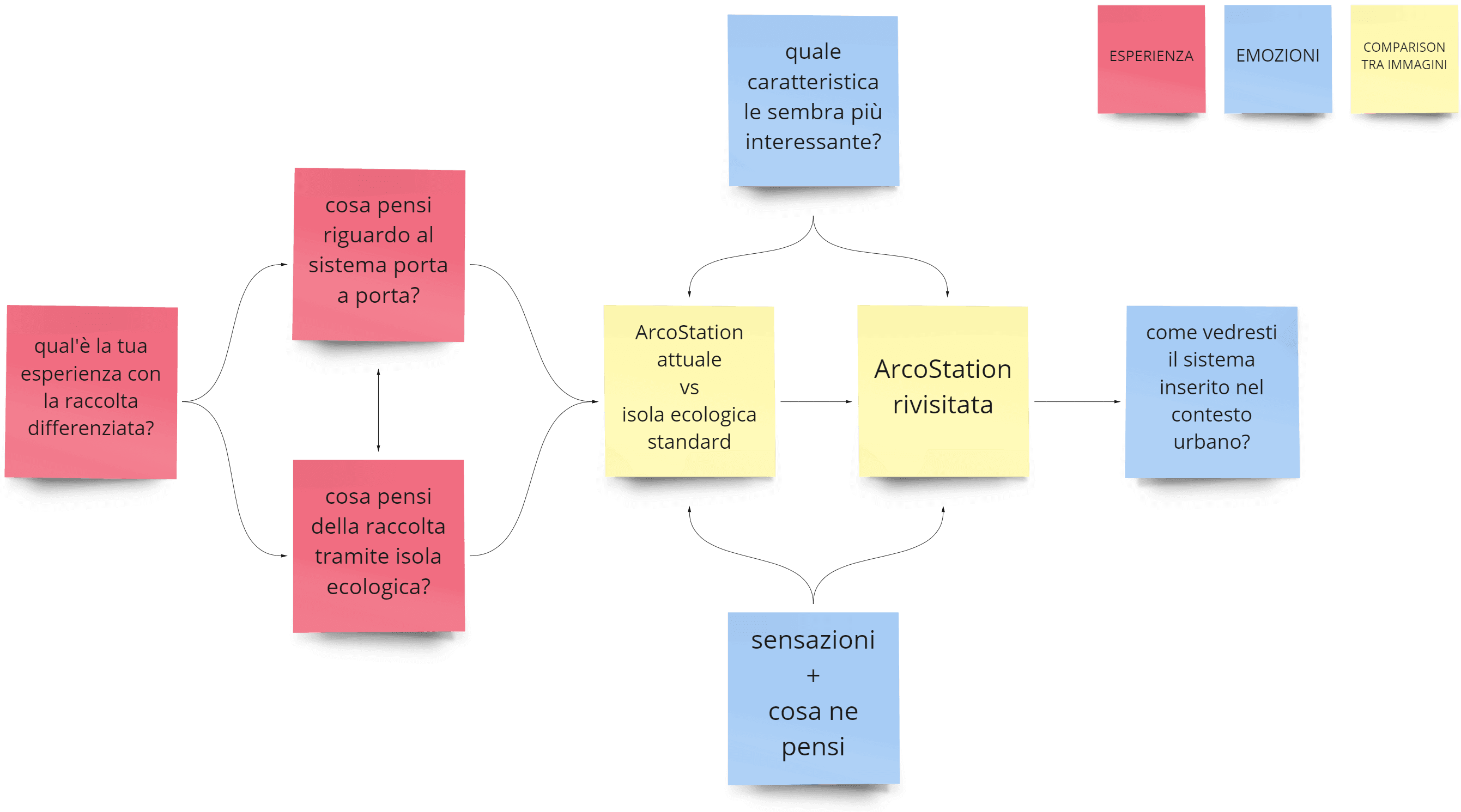
Structure of the interview divided in categories.